This page is used to study the effectivity of introducing new chart types to a blind individual, by comparing a direct approach to a gradual approach (starting from a known chart type and explaining the transitions).
Here is the data.
Imagine a sequence logo plot as a series of vertical bars that are stacked on top of each other, where each bar represents a position in a sequence. Here’s how you can visualize and draw it:
We now introduce the sequence logo in three steps. We start with a bar chart, then transition to a stacked bar chart, before introducing the sequence logo. Base the sketches for these charts solely on the descriptions you hear here, and not on the previous description.
Imagine a series of vertical bars arranged side by side on a horizontal axis. Each bar represents a different position along the x-axis, from 0 to 9. The height of each bar corresponds to the total value for that position, given by `y_total`. Visual Elements:
To transform the bar chart into a stacked bar chart, you break each black bar into four segments stacked on top of each other, with each segment representing a different letter: A, G, C, and T. The height of each segment within a bar corresponds to the value of A, G, C, and T, respectively.
Visual Elements:
In a sequence logo plot, each position along the x-axis is depicted as a stack of letters, with the height of each letter representing its frequency. The letters are arranged in order of their predominance, with the most frequent letter at the top.
Visual Elements:
Pause here and review all previous charts while getting feedback about whether visual elements are correct.
Since the dataset used to create the Circos plot is large, it is not easily browsed. Therefore, it is omitted.

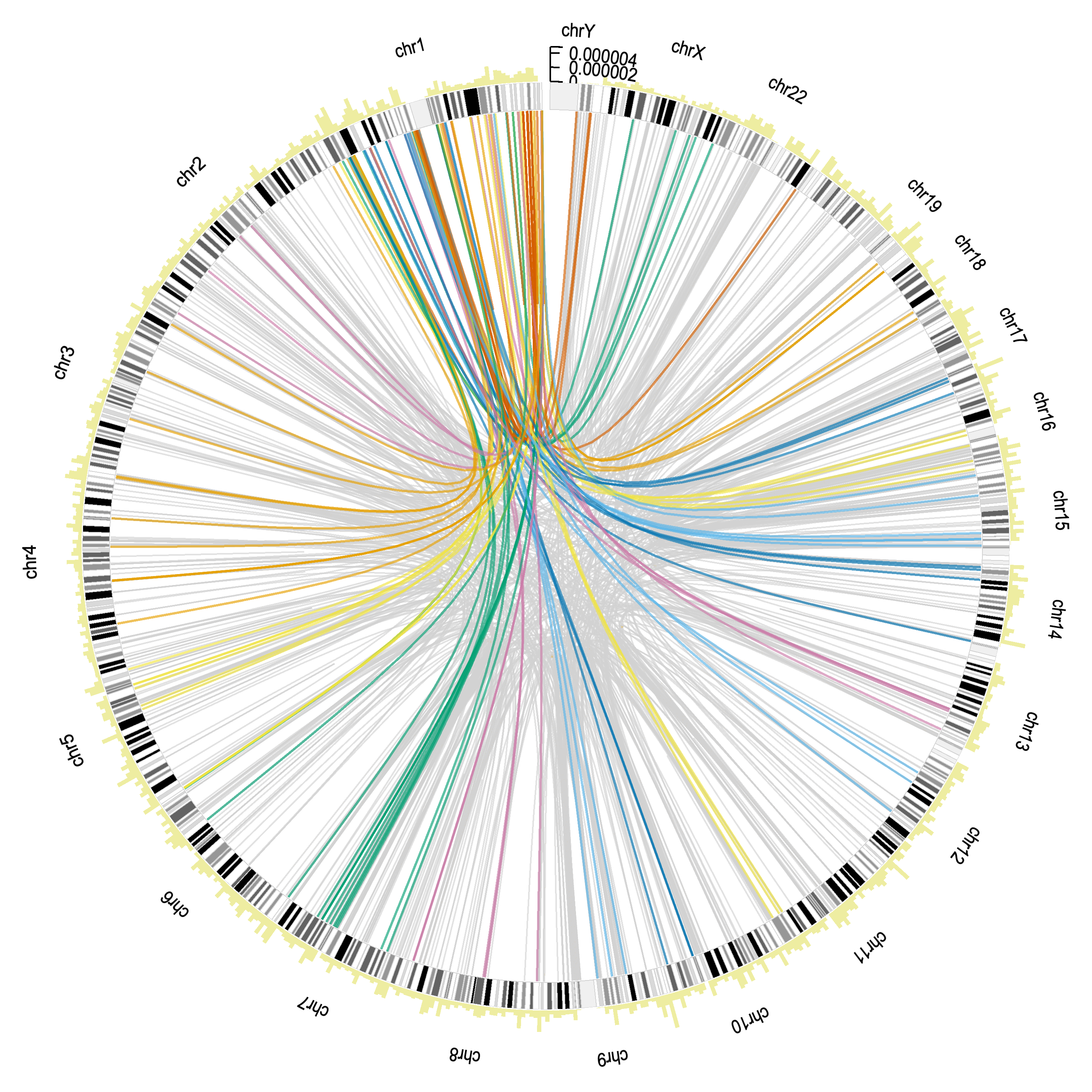
Imagine a circular chart resembling a clock face, called a circos plot. Envision this plot as a ring divided into several sections, each representing a different segment of a genome, like different hours on a clock. Around the outer edge of this ring, imagine a series of vertical bars forming a bar chart. These bars represent counts of genomic features and vary in height. Some are tall, while others are short, creating a jagged, uneven ring of bars encircling the plot. Inside this outer ring, within the main circle, there are numerous lines connecting different sections of the ring. These lines come in two types: gray lines and colored lines. The gray lines are more numerous and connect different segments of the genome, showing relationships between pathway genes. These lines crisscross the interior of the circle, forming a complex web of connections. In addition to the gray lines, there are also colored lines inside the circle. These lines are fewer but more vivid, representing highly similar genomic regions. They stand out against the gray lines due to their bright colors and also connect different segments of the genome, forming distinct, colorful arcs. In summary, a circos plot features a ring with a bar chart around the outer edge, while the inside of the ring is filled with a web of gray lines and colorful arcs, illustrating connections and similarities between different genomic regions.

Imagine a long, horizontal black rectangle. This rectangle is a solid color and stretches wide across your drawing area. Along the top edge of this rectangle, evenly spaced, are the names of the human chromosomes. These names are simple labels, starting from "1" on the left side and progressing sequentially to "22," followed by "X" and "Y" towards the right side. Each name is written in a small, clear font, positioned directly above its corresponding section of the rectangle.

Now, envision transforming this black rectangle into a series of individual segments. Each segment represents one of the human chromosomes. To do this, draw vertical lines from the top to the bottom of the rectangle, splitting it into distinct sections, each one labeled with a chromosome name. The length of each segment corresponds to the relative size of the chromosome it represents. This creates a visual map of the chromosomes laid out in a linear sequence.

Next, imagine drawing a bar chart directly above each chromosome segment. The bars vary in height, corresponding to different counts or values. Each bar is positioned directly above its respective chromosome segment. The height of each bar represents data counts related to that chromosome. For example, if chromosome 1 has a high count, its bar will be taller compared to chromosome 2 if it has a lower count. This creates a combined visual of the ideogram with a bar chart above it.
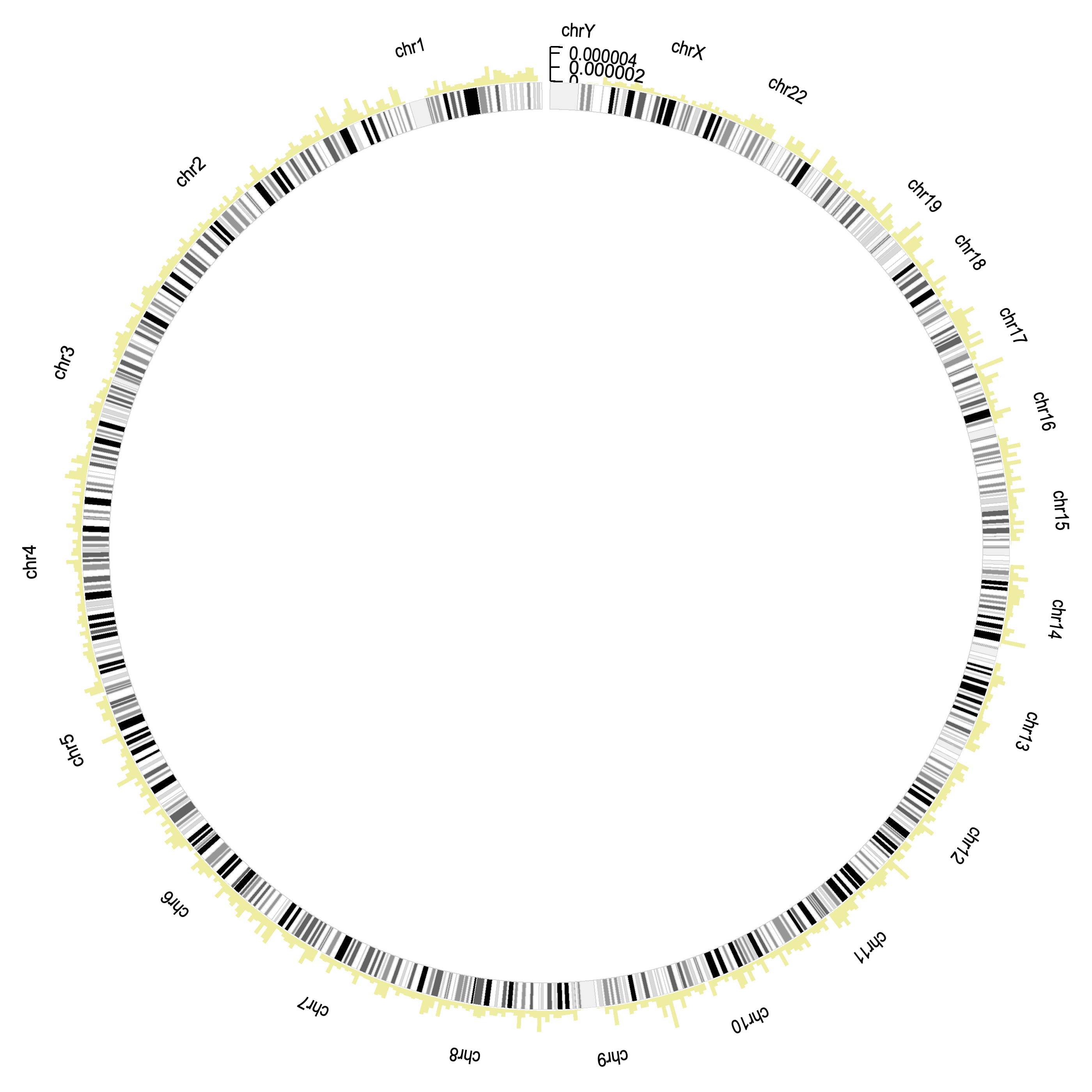
Now, visualize bending the entire structure into a circle. The linear ideogram and the bar charts above it form a continuous loop, creating a circular shape. The chromosome segments curve around the circle's circumference, maintaining their relative sizes and positions. The bar charts also curve outward, forming a ring around the ideogram. The result is a circular layout where the chromosome names and segments are on the inner side of the circle, and the bar charts extend outward, forming an outer ring.
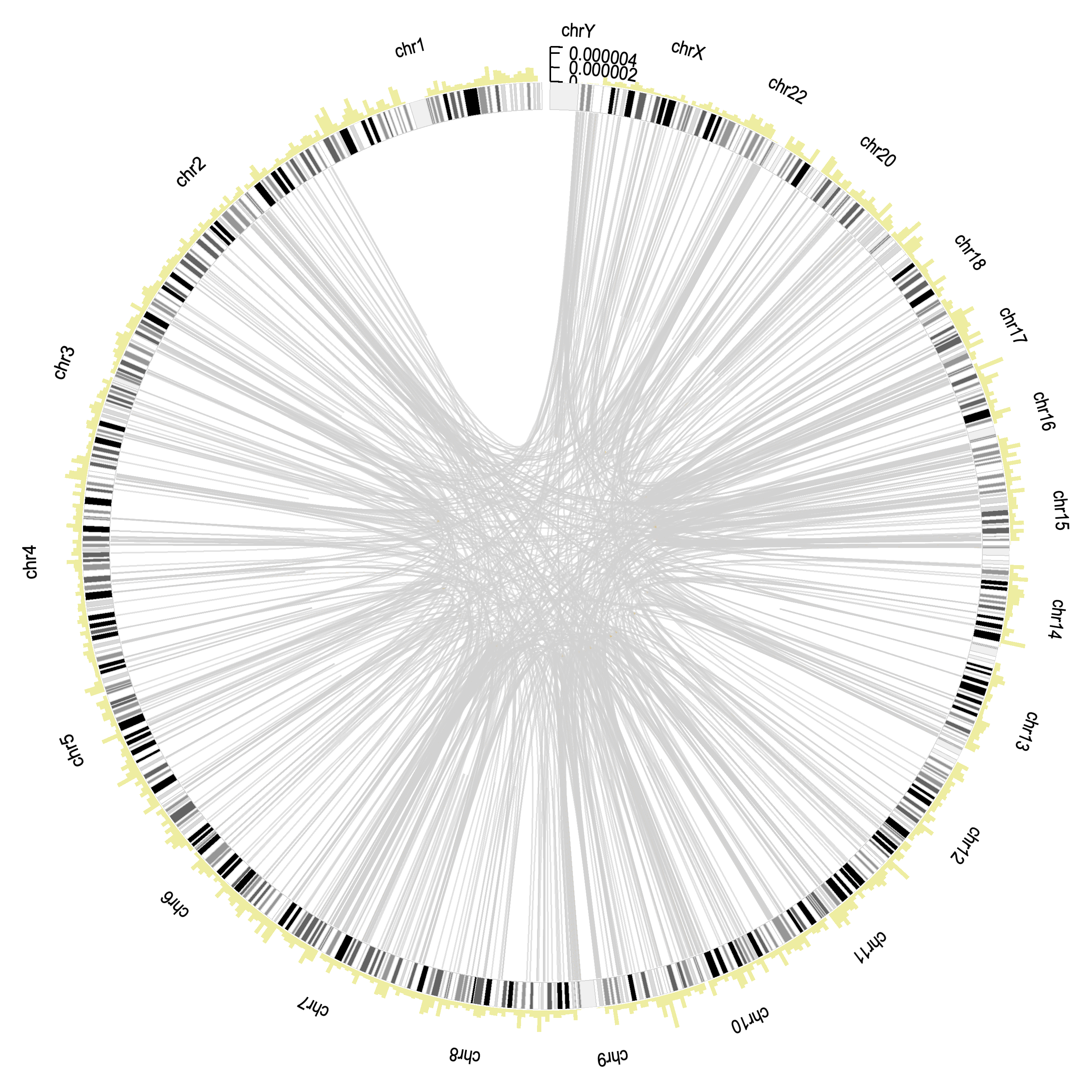
Imagine drawing connections within the circular ideogram. Inside the circle, there are thin, gray lines connecting different chromosome segments. These lines represent pathway genes, showing relationships between specific positions on different chromosomes. The lines vary in length and curve smoothly, connecting various points around the inner circle, resembling a network of pathways or threads linking different genomic regions.

Finally, enhance the plot with additional colored lines. Alongside the gray connecting lines, add thicker, colored lines inside the circle. These colored lines represent highly similar genomic regions. Each line has a distinct color, such as red, blue, green, or yellow, indicating different similarities. These colored lines also connect various chromosome segments, weaving through the gray lines, creating a vibrant and complex web of connections within the circular ideogram. The final plot is a detailed, colorful representation of genomic relationships, with both gray and colored lines illustrating different types of connections.
Pause here and review all previous charts while getting feedback about whether visual elements are correct.